10 Best Free Online Website Resposive Checker Services
Here is a list of the best free online website responsive checker services. A website responsive checker is a measure to test how well the website loads on various devices. There are a wide variety of devices with different OS, screen sizes, and form factors. This check lets you test how the website loads on those devices. This is a crucial step in website development. Making a website device-compatible makes it easily accessible to a broader user base with different devices.
This post covers 10 services or tools where you can test the responsiveness of a website. All these services are free to use and come with their own set of features and limitations. Some of these services have a wide catalog of devices covering mobiles, tablets, and desktops. You can easily pick a device of choice and test your website on that. It loads the website on the selected device resolution. You can interact with the website and check how different components renders and behave on that resolution. Some of these services target mobile-friendliness only. So if you are improving the mobile version of the website, you can try those services.
My Favorite Online Website Responsive Checker
BlueTree.ai is my favorite service on this list to check a website’s responsiveness online. This is one of the best services that offers dozens of mobile, tablet, and desktop devices covering all the possible screen resolutions. All devices are fully interactive and you can also open two devices side by side for comparison. If you can not find a resolution you need, you can add a custom resolution for the check. While doing so, you can take screenshots on the go. This all makes it my favorite on this list. You can go through the list and check these out yourself.
You can also check out our other lists of the best free online Readability Checker Websites, online Screen Resolution Checker Websites, and online Domain Health Checker Websites.
BlueTree.ai
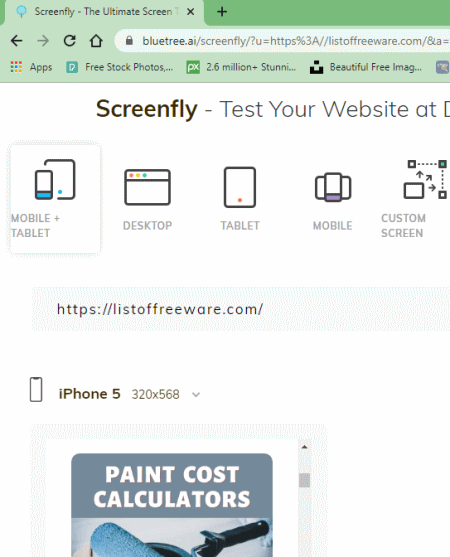
BlueTree.ai is a free online website responsive checker service. This is one of the best services to check the responsiveness of any website. All you have to do is add the URL of the website that you want to check. It instantly loads that website on a mobile and a tablet device side by side. You can interact with that to see how responsive the website feels on those devices. Apart from that, there is a whole catalog of mobile, tablet, and desktop devices. You can check your website with any of those devices. And if you want to test it on a custom resolution, you get an option for that as well. You can rotate the screen of the target device anytime to test the website layout in both, portrait and landscape, orientations. If you have to share the results, you can get a link to that or just share it directly via email or popular social platforms.
How to check website responsiveness using this service?
- Use the link given below leading to this responsiveness checker service.
- Enter the website URL at the top and then click the “GO” button.
- On the next screen, you can pick the devices to check the responsiveness of the website.
Highlights:
- Number of devices/resolution: A wide catalog of mobile, tablet, and desktop devices with an option for custom resolution, compare devices, and take screenshots.
- Check Method: Manual interaction.
WebsitePlanet.com
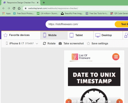
WebsitePlanet.com is another free online website responsive checker service. You can use this service for free without any account. It has a wide collection of devices to check the responsiveness of any website. There are three sections; Mobile, Tablet, and Desktop. Each section has its own set of devices that you can pick and check the website on. In the case of Mobile and Tablet devices, you can even change the orientation to landscape if required. On top of that, each device UI comes with a screenshot button. This means you can take a screenshot of the rendered website at any time. There is also a “Compare” section. In this section, you can select two devices and loads the website on both of those devices. Then you compare the website responsiveness side by side by both devices. And, if you have to check the responsiveness frequently, then you can save your device-specific settings to easily access that later.
How to check website responsiveness using this service?
- Go to this service using the link given below.
- Enter the website URL at the top and then click the “Test My Site” button.
- On the next screen, you can pick the devices to check the responsiveness of the website.
Highlights:
- Number of devices/resolution: A wide catalog of mobile, tablet, and desktop devices with an option for custom resolution, compare devices and take screenshots.
- Check Method: Manual interaction.
BrowserStack.com
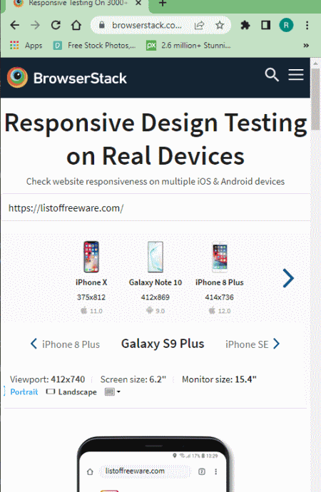
BrowserStack.com is a free service to check the responsiveness of any website. This service can help you check the responsiveness of your website on dozens of free devices. It has a list of 13 different devices covering various common screen resolutions and platforms. You can pick a device of your choice and check how responsive the website is on that device. Similarly, you can check the website with different devices covering different screen resolutions. You also get an option to change the orientation of the device. By default, it loads the website in portrait orientation but you can change it to landscape. Do note that, this orientation option is only available for mobile devices only. And, you have to create a free account to use this service.
How to check website responsiveness using this service?
- Use the link given below to go to the landing page of this online service.
- Add the website URL that you want to check at the top and click the “Check” button.
- Then, select the screen resolution for which you want to test the website.
Highlights:
- Number of devices/resolution: 13 free devices covering 13 different resolutions. Also lets you change orientation for mobile devices.
- Check Method: Manual interaction.
- A free account is required to use the service.
WebsiteResponsiveTest.com
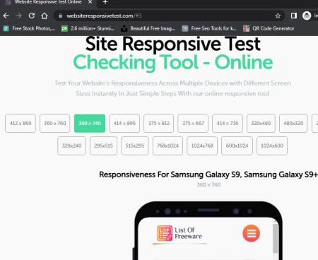
WebsiteResponsiveTest.com is a free online website responsive checker service. This service offers 17 free screen resolutions to test your website. You can pick a resolution of your choice to check the responsiveness of the website with that particular resolution. When you pick a resolution from the given options, it shows you the devices with that resolution. It also uses a silhouette of one of the listed devices and loads the website inside that. You can interact with the device mockup and check the rendering and responsiveness of the website.
How to check website responsiveness using this service?
- Follow the link provided below to go to the landing page of this online service.
- Enter the website URL that you want to check at the top and click the “Check it” button.
- Then, select the screen resolution for which you want to test the website.
Highlights:
- Number of devices/resolution: 17 free screen resolution settings.
- Check Method: Manual interaction.
Ready.mobi
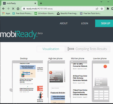
Ready.mobi is a free service to check website responsiveness online. Unlike other services on this list, it automates responsive testing. It mainly checks how mobile-ready a website is. So all you have to do is enter the URL of the website that you want to test for responsiveness. When you do that, it loads that website on four different resolutions covering desktop and 3 mobile tiers. You can still fully interact with the devices manually and check the website yourself. Below that, you get a report where it shows the result of 30+ tests. It gives you the number of tests that the website passes, minorly fails, and majorly fails. Along with that, you get a website score and page weight matrices as well. This service also gives you suggestions to further improve the website. And you can also email the report to yourself or anybody else.
How to check website responsiveness using this service?
- Use the link given below to go to this online service.
- Enter the website URL at the top and click the “GO” button.
Highlights:
- Number of devices/resolution: 4 free screen resolution settings.
- Check Method: Automated testing with a report.
UsePastel.com
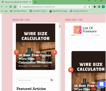
UsePastel.com is another free service to check website responsiveness online. This is quite simple and basic service where you can add the URL to load the website on two target devices. It uses a mobile and a tablet device for that. Both devices loads teh website side by side on the same screen. You can interact with both and compare how different components of the website response on each device. That’s pretty much all you get here. Only two devices side by side, no other resolution option.
How to check website responsiveness using this service?
- Follow the link given below to go to the landing page of this online service.
- Enter the website URL that you want to check at the top and click the “Preview website” button.
Highlights:
- Number of devices/resolution: 2 free screen resolution settings.
- Check Method: Manual user interaction.
SEOptimer.com
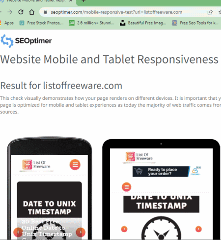
SEOptimer.com is a popular website that offers SEO and other related tools. It has a free Website Mobile and Tablet Responsiveness Tester. This is a free tool to check the website’s responsiveness on different resolutions or devices. The tool is pretty basic. You give it the URL of the website that you want to check and it renders the homepage on two different devices covering two different resolutions. One is mobile and another is a tablet. Both devices load the website in portrait orientation. However, it is not interactive. It is just a still render of the homepage. Neither is an automated report nor you can interact with the devices.
How to check website responsiveness using this service?
- Go to this tool on SEOptimer using the link given below.
- Enter the website URL in the box there and click the “GO” button.
Highlights:
- Number of devices/resolution: 2 free screen resolution settings.
- Check Method: Automatic with non-interactive website renders.
Rankwatch.com
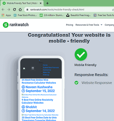
Rankwatch.com offers a free tool to check the mobile-friendlyness of a website. This is a quite basic tool that automatically checks the website against certain measures. To do that, you have to provide the website URL along with your email address. Once the test is complete, you can opt-in to get the result via email. Otherwise, you can check that right there. It does not offer much in the results tho. It just tells you whether the website is mobile-friendly or not.
How to check website responsiveness using this service?
- Follow the link given below to open this mobile responsiveness test page in your browser.
- Enter the website URL and your email address in the respective boxes.
- Then complete the captcha and run the test.
Highlights:
- Number of devices/resolution: N/A.
- Check Method: Automatic with non-interactive website renders.
DupliChecker.com
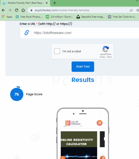
DupliChecker.com has a simple online tool to test the mobile-friendliness of a website. You can add the URL of the website that you want to check and complete a captcha to get the results. It simply renders the website on a mobile device and shows that on the screen. It does not give you an interactive render. Instead, it automatically checks the website and directly tells you if the website is mobile-friendly or not. For that, it gives a page score to the website. The more the score, the mobile-friendly the website is.
How to check website responsiveness using this service?
- Follow the link given below to open this tool in your browser.
- Enter the website URL in the box there.
- Then complete the captcha and start the test.
Highlights:
- Number of devices/resolution: N/A.
- Check Method: Automatic with non-interactive website renders.
SmallSEOTools.com
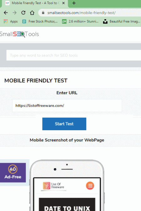
SmallSEOTools.com is yet another website with a free online website responsive checker. This tool also checks the mobile-friendliness of a website. When you run the check, it automatically runs tests on the website and gives you the results. Based on the tests, it gives a mobile-friendliness score to the website. For the most part, it is the loading speed of the website on a mobile device. It also shows a render of the website on the mobile screen. This shows how the website renders on a mobile device. That’s all you get with this free tool.
How to check website responsiveness using this service?
- Use the link given below to open this tool in your browser.
- Enter the website URL in the box there and click the “START TEST” button.
Highlights:
- Number of devices/resolution: N/A.
- Check Method: Automatic with non-interactive website renders.


About Us

We are the team behind some of the most popular tech blogs, like: I LoveFree Software and Windows 8 Freeware.
More About UsArchives
- May 2024
- April 2024
- March 2024
- February 2024
- January 2024
- December 2023
- November 2023
- October 2023
- September 2023
- August 2023
- July 2023
- June 2023
- May 2023
- April 2023
- March 2023
- February 2023
- January 2023
- December 2022
- November 2022
- October 2022
- September 2022
- August 2022
- July 2022
- June 2022
- May 2022
- April 2022
- March 2022
- February 2022
- January 2022
- December 2021
- November 2021
- October 2021
- September 2021
- August 2021
- July 2021
- June 2021
- May 2021
- April 2021
- March 2021
- February 2021
- January 2021
- December 2020
- November 2020
- October 2020
- September 2020
- August 2020
- July 2020
- June 2020
- May 2020
- April 2020
- March 2020
- February 2020
- January 2020
- December 2019
- November 2019
- October 2019
- September 2019
- August 2019
- July 2019
- June 2019
- May 2019
- April 2019
- March 2019
- February 2019
- January 2019
- December 2018
- November 2018
- October 2018
- September 2018
- August 2018
- July 2018
- June 2018
- May 2018
- April 2018
- March 2018
- February 2018
- January 2018
- December 2017
- November 2017
- October 2017
- September 2017
- August 2017
- July 2017
- June 2017
- May 2017
- April 2017
- March 2017
- February 2017
- January 2017
- December 2016
- November 2016
- October 2016
- September 2016
- August 2016
- July 2016
- June 2016
- May 2016
- April 2016
- March 2016
- February 2016
- January 2016
- December 2015
- November 2015
- October 2015
- September 2015
- August 2015
- July 2015
- June 2015
- May 2015
- April 2015
- March 2015
- February 2015
- January 2015
- December 2014
- November 2014
- October 2014
- September 2014
- August 2014
- July 2014
- June 2014
- May 2014
- April 2014
- March 2014
