6 Best Free Online Data Visualization Tool
Here is a list of Best Free Online Data Visualization Tool. Using these web services, you can easily visualize datasets on different types of graphs such as line, bar, column, area, scatterplot, pie, donut, and more. Some online tools provide you various advanced chart types to visualize data including multiple donut, convex hull, hexagonal binning, Voronoi tessellation, sunburst, Gantt chart, combination chart, parallel coordinates, treemap, and more. The data visualization process is very simple in all. You just have to import datasets from different sources and then generate a chart by setting up different options.
In these tools, you can create a new sheet or upload an existing spreadsheet in formats like Excel, CSV, TSV, etc. Some even let you input the dataset from an external source by providing respective URL. After providing dataset, you have to select chart type and setup some plotting options like data range, chart subtype, chart style, chart title, legend, series, format, etc. You can later save the generated graph as an image. Plus, options to publish chart online and embed chart code into your website are also available in some of these online data visualizer. All in all, these are really handy online or cloud based tools that anyone can use to plot data on charts.
Many of these are complete spreadsheet processing tools that provide various other features like real-time collaboration, export options, mathematical formulae, chat feature, and more. Checkout the list to know more about these online tools.
My Favorite Best Free Online Data Visualization Tool:
Datawrapper is one of my favorites as it offers a simplistic approach to generate data visualization chart. Plus, it offers several kinds of charts to visualize dataset.
RAWGraphs is another good one as it lets you generate some complex graphs.
You may also like some best free Portable Spreadsheet Software, Cloud Based Spreadsheet Tools, and Spreadsheet Software.
Datawrapper
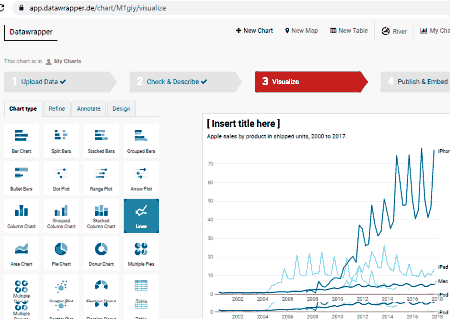
Datawrapper is a free online data visualization tool. Using this web service, you can analyze and visualize datasets by using charts, maps, and tables. It is very easy to use and requires no signup; you can simply start importing dataset and then plotting respective graphs. However, if you want to save and access your charts from cloud, you can register your account on its website and login to view all your graphs anytime.
It lets you plot different types of graphs that include bar, split bars, stacked bars, grouped bars, dot plot, arrow plot, area, pie chart, donut, line, scatter plot, multiple donuts, etc. Let us have a look at how to plot graphs using this online data visualizer.
How to visualize data using Datawrapper:
- Upload Data: You can import your dataset using different methods including copy & paste data table, import from XLS or CSV file, import Google Sheet, or upload data from an external link. Some sample datasets are also provided by it that you can use.
- Check & Describe: Now, check your dataset if it looks right or not. You can edit the column and data and then click on the Proceed to move on to the next step.
- Visualize: Next, you can choose chart type from all available ones, refine chart options (labels, chart size, appearance, sorting & grouping, etc.), annotate your chart, and finally select a layout design.
- Publish & Embed: At last, you can publish your chart to the online world and also embed it into a webpage. You can even export a chart as PNG image.
Additional Features:
- You can enable social media share button to share a chart directly on a social networking site.
Limitations:
- The free plan of this web service restrict some advanced features that you get only in its premium plans.
Conclusion:
It is a great online data visualization tool which lets you plot dataset using variety of charts.
RAWGraphs
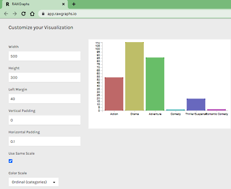
RAWGraphs is a free open source online data visualization tool. It is an easy to use tool that lets you visualize datasets on various types of charts. You can plot some advanced types of graphs using this tool, such as convex hull, hexagonal binning, scatter plot, Voronoi tessellation, sunburst, Gantt chart, parallel coordinates, etc. If you want, you can write and add your custom chart as well. Let us see how you can generate graphs using this online service.
How to visualize data using RAWGraphs:
- Load your data: You can import your dataset by copying and pasting data, uploading a dataset file, or providing a URL link to fetch data from. It also lets you try some sample datasets to plot graphs.
- Choose a chart: Select a chart type to visualize your data.
- Map your dimensions: Map columns to X-Axis, Y-Axis, Size, Color, and Label to customize your chart.
- Customize your visualization: Now, you can edit some chart options including width, height, margins, color scale, show points, and more.
- Download: When done, you can download your chart in SVG, PNG, and JSON formats. An embed code is also generated which you can use to insert into your webpage.
Conclusion:
RAWGraphs is a dedicated free online data visualization tool that provides several chart types to generate data visualization graphs.
Google Sheets
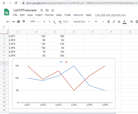
Google Sheets is a popular cloud spreadsheet service that also acts as an online data visualization tool. It is a widely used application used for processing spreadsheets. Along with several spreadsheet tools, it also offers standard data visualization charts. Some of the charts it lets you plot include line, bar, area, column, scatterplot, pie, map, waterfall, gauge, scorecard, treemap, organizational chart, and more.
It is very simple to understand and you won’t face any difficulty in creating plots. For novice users, I have listed the steps to create graphs. Let us checkout.
How to visualize data in Google Sheets:
- Add Dataset: First, open an existing sheet (XLSX, ODS, CSV, etc.) or create a new one from scratch.
- Insert Chart: Now, go to its Insert menu and select Chart option and then edit chart options. You can set up graph options like chart type, data range, data series, etc.
- Edit Chart: You can customize chart style, legend, labels, trendline, chart & axis title, etc. It will display the customize chart over the sheet.
- Save & Publish: It lets you export charts in PNG, PDF, or SVG format. You can also publish and share your graphs with online world.
Additional Features:
It is a real-time collaboration spreadsheet tool that offers some additional features including inbuilt chat options, sheet protection features, several export formats, and a lot more.
Conclusion:
For ardent users of Google Sheets, it is one of the best alternatives to an online data visualization tool as you can easily generate some common charts for your datasets.
Microsoft Excel Online
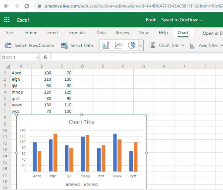
Microsoft Excel Online is yet another free online data visualization tool. It is the free web version of Microsoft Excel which is a paid software. In case you want to use it for free with some feature limitations, you can try its cloud edition. All your spreadsheet data along with charts are saved on your OneDrive account. It allows you to generate different types of charts like column, pie, bar, area, scatter, sunburst, treemap, Pareto, radar, etc. Let us see how you can visualize graphs using it.
How to visualize data in Microsoft Excel Online:
- Firstly, import a dataset from an existing spreadsheet file or generate a new spreadsheet in it.
- Next, select data that you want to plot and go to its Insert tab and choose the Insert Chart > Chart Type option.
- Now, you can edit and setup different parameters of the chart including chart title, legend, and series.
- After that, you can save the spreadsheet with chart in formats including XLSX and ODS.
Conclusion:
It is an online real-time collaboration spreadsheet tool that also provides you various charts to plot and visualize data on graphs.
Zoho Sheet
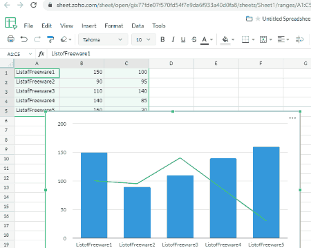
Zoho Sheet, as the name suggests, is primarily a spreadsheet tool that also lets you visualize datasets. In it, you can simply import or create a spreadsheet and then visualize the dataset on various kinds of graphs. It provides you charts like column, bar, line, pie, area, scatter, combination, waterfall, funnel, spider web, word cloud, and some more. You can also customize your chart and then save it as an image. Let’s checkout sorted steps to create data plots using this free web service.
How to visualize data using Zoho Sheet:
- First, log in to your registered Zoho Sheet account and upload your spreadsheet for which you want to plot datasets. You can also generate a fresh spreadsheet.
- Now, go to the Insert > Chart option and select the chart type that you want to create.
- After that, customize data range, series, labels, axis titles, style, and more chart options.
- You will now be able to see the chart that you can download as a PNG image. It also provides you options to publish chart to the web or embed the code into your webpage.
Additional Features:
- Audit Trail, Create Versions of a Spreadsheet, Real-time Collaboration, and more features are provided by this cloud based spreadsheet tool.
Conclusion:
This one is a nicely designed spreadsheet tool with the capability to plot data on several types of charts.
WPS Cloud
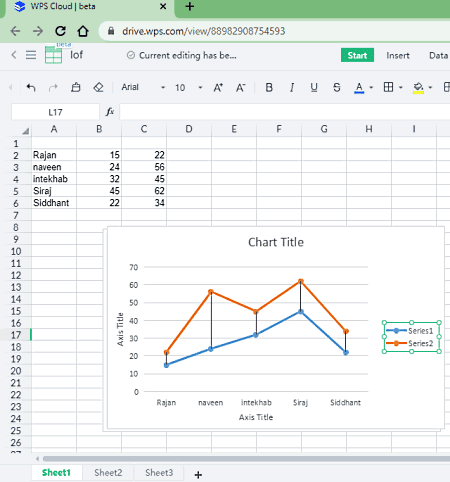
WPS Cloud is a cloud based office suite that can also be used as an online data visualization tool. It provides you document, spreadsheet, and presentation processing tools. Using its spreadsheet features, you can visualize datasets. You can plot your data on histogram, line, bar, area, scatter, stock, and radar charts. Here are the steps to generate charts in this web data visualization service.
How to visualize data in WPS Cloud:
- Start with uploading your existing spreadsheet or add create new spreadsheet.
- Now, select the data range manually from the interface and then go to Insert tab.
- From the Insert tab, select a desired chart type and then you will be able to visualize data plot.
- Afterward, you can customize chart elements and format as per your requirement.
- At last, you can save the chart in PNG format.
Conclusion:
All in all, it is cloud office software that lets you visualize your datasets using various graphs.


About Us

We are the team behind some of the most popular tech blogs, like: I LoveFree Software and Windows 8 Freeware.
More About UsArchives
- May 2024
- April 2024
- March 2024
- February 2024
- January 2024
- December 2023
- November 2023
- October 2023
- September 2023
- August 2023
- July 2023
- June 2023
- May 2023
- April 2023
- March 2023
- February 2023
- January 2023
- December 2022
- November 2022
- October 2022
- September 2022
- August 2022
- July 2022
- June 2022
- May 2022
- April 2022
- March 2022
- February 2022
- January 2022
- December 2021
- November 2021
- October 2021
- September 2021
- August 2021
- July 2021
- June 2021
- May 2021
- April 2021
- March 2021
- February 2021
- January 2021
- December 2020
- November 2020
- October 2020
- September 2020
- August 2020
- July 2020
- June 2020
- May 2020
- April 2020
- March 2020
- February 2020
- January 2020
- December 2019
- November 2019
- October 2019
- September 2019
- August 2019
- July 2019
- June 2019
- May 2019
- April 2019
- March 2019
- February 2019
- January 2019
- December 2018
- November 2018
- October 2018
- September 2018
- August 2018
- July 2018
- June 2018
- May 2018
- April 2018
- March 2018
- February 2018
- January 2018
- December 2017
- November 2017
- October 2017
- September 2017
- August 2017
- July 2017
- June 2017
- May 2017
- April 2017
- March 2017
- February 2017
- January 2017
- December 2016
- November 2016
- October 2016
- September 2016
- August 2016
- July 2016
- June 2016
- May 2016
- April 2016
- March 2016
- February 2016
- January 2016
- December 2015
- November 2015
- October 2015
- September 2015
- August 2015
- July 2015
- June 2015
- May 2015
- April 2015
- March 2015
- February 2015
- January 2015
- December 2014
- November 2014
- October 2014
- September 2014
- August 2014
- July 2014
- June 2014
- May 2014
- April 2014
- March 2014
