4 Best Free Online Real Time Data Visualization Tools
Here is a list of Best Free Online Real Time Data Visualization Tools. These free online websites let you visualize numerical datasets in form of graphs in real time. You can simply enter datasets and visualize respective graph simultaneously. These websites let you generate graphs of multiple types including line, bar, scatter, pie, area, box plot, circle packing, pareto, sunburst, Gantt chart, parallel coordinates, and more. To enter data to these online websites, these let you import an Excel or CSV spreadsheet file. If you want, you can also manually enter data to visualize it.
Options to customize chart and its elements like background, font, line width, point size, line type, color, height, width, and more are also provided in these tools. Furthermore, one of these lets you insert images, custom text, and form elements to the graph to make it more informative. You can also add and edit legends and tooltips in charts. These let you export graphs to various file formats including PDF, PNG, SVG, JPG, etc. One of these real time data visualization tools let you export chart with entire dataset in PowerPoint and Excel formats. You can also share data visualization graphs on various online platforms like Twitter, Facebook, Whatsapp, Linkedin, etc. Plus, you can generate an HTML code for your chart to embed it into websites.
My Favorite Free Online Real Time Data Visualization Tools:
Visualize is one of the best tool as it can create complicated as well as minimalistic charts. Plus, you can export charts and related data to a variety of formats.
If you want a simple graphing tool, then go for Visuafy.
You may also like some best free Portable Spreadsheet Software, Cloud Based Spreadsheet Tools, and Online Data Visualization Tools.
Visualize
Visualize is a good free real time data visualization website. It allows you to generate a variety of charts to visualize and analyze datasets such as bar, line, radar, scatter, pie, word cloud, donut, box plot, circle packing, pareto, etc. You can create simple as well as complex graphs using this website. To create your own data visualization graphs in it, you need to register and login into your account. Checkout its primary features below.
Main Features:
- It lets you upload Excel or CSV file to enter data sets, or you can manually enter your data.
- You get an Interactive Analytic Dashboard with drag and drop designer to analyze and create graphs.
- It lets you work on different datasets in multiple tabs.
- You can format the chart as per your requirement e.g., background, trend line, font, etc.
- A dedicated Toolbox to view data as chart, crosstab, table, or freehand table is available in it. The toolbox also provides you options to filter data and add form elements, chart, image, or text to the chart.
- You can preview the chart before exporting it.
- It lets you share graph on Twitter, Facebook, etc. You can also copy link to your graph and share it online.
- The final graph with entire dataset can be saved in multiple formats including Excel, PDF, PowerPoint, PNG, HTML, etc.
Conclusion:
It is a great free real time data visualization tool using which you can create complicated graphs with an interactive dashboard.
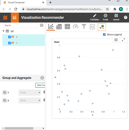
RAWGraphs
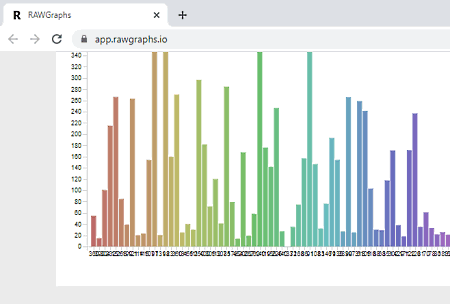
RAWGraphs is another real time data visualization tool. Using it, you can visualize datasets in real time on various types of charts, like hexagonal binning, scatter plot, convex hull, Voronoi tessellation, sunburst, Gantt chart, parallel coordinates, etc. It even offers you an option to create custom chart with the help of scripts. Below are its main features that you can look out for.
Main Features:
- You can import the dataset from a spreadsheet file, a URL link, or by manually entering data.
- It lets you choose columns and labels to map in the graph.
- You can customize chart width, height, margins, color scale, show points, and more to set up data visualization accordingly.
- The final chart can be downloaded in SVG, PNG, and JSON formats. And, it also generates an HTML code to embed into the website.
Conclusion:
It is a nice and simple online website to visualize datasets in real time.
Visuafy
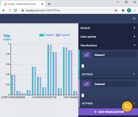
Visuafy is online real time data visualization website. It lets you create different kinds of chart to visualize your data including bar, line, pie, scatter, radar, and mixed charts. You can simply enter your data and it will create a data visualization graph in real time. It also lets you customize the chart as you want. Furthermore, you can publish and share graphs online. Let us have a look at its main features now.
Main Features:
- It provides chart templates in different color and themes. So, you can design stylish data visualizer graphs using this online service.
- You can directly paste data into its spreadsheet-like interface or you can upload a locally saved spreadsheet file to create graphs.
- It provides several customization features that include background formatting, resize graph, graph color theme, visualization options (symbol, data orientation, labels, etc.), and more.
- You can also enable or disable elements that you want to show or hide in your graph, such as title, legend, tooltip, zoom, etc.
- You can make a clone of a graph to later edit or customize it.
- It lets you download the data visualization chart in image formats (JPG, PNG) and PDF file. You can also generate HTML code to embed graph in websites.
- You can directly share graph to Twitter, Facebook, Pinterest, Linkedin, Reddit, and WhatsApp.
Conclusion
It is a simple yet effective online tool that let you generate data visualization graphs in real time.
ChartBlocks
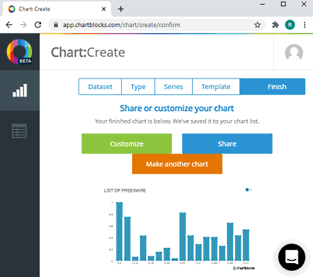
ChartBlocks is yet another free online real time data visualization website. Using it, you can enter your data and visualize it on graph in real time. It follows a few simple steps in order to creat graphs. Simply add dataset, select chart type, choose series, and select chart template to create a graph. You can create bar, line, scatter, and pie graphs using this online tool. To visualize real time graphs, simply go to its Data tab and start entering data into it. As you type data, it will show you graph.
Main Features:
- You can upload CSV and Excel spreadsheet files for data visualization.
- It lets you customize line width, point shape, point size, background, font, dimensions, and more parameters.
- You can add and customize legend in the chart.
- A feature to add tooltip is also available in it.
- You can add data labels and meta description to your charts.
- It lets you save a graph in PDF, PNG, SVG, EPS, and PS file formats.
Limitations:
It imposes various limitations in its free plan such as up to 50 active charts, limited export formats, etc. To remove these limitations, you can upgrade to its premium plans.
Conclusion:
It is a nice online website to visualize and analyze data in real time using various graphs.


About Us

We are the team behind some of the most popular tech blogs, like: I LoveFree Software and Windows 8 Freeware.
More About UsArchives
- May 2024
- April 2024
- March 2024
- February 2024
- January 2024
- December 2023
- November 2023
- October 2023
- September 2023
- August 2023
- July 2023
- June 2023
- May 2023
- April 2023
- March 2023
- February 2023
- January 2023
- December 2022
- November 2022
- October 2022
- September 2022
- August 2022
- July 2022
- June 2022
- May 2022
- April 2022
- March 2022
- February 2022
- January 2022
- December 2021
- November 2021
- October 2021
- September 2021
- August 2021
- July 2021
- June 2021
- May 2021
- April 2021
- March 2021
- February 2021
- January 2021
- December 2020
- November 2020
- October 2020
- September 2020
- August 2020
- July 2020
- June 2020
- May 2020
- April 2020
- March 2020
- February 2020
- January 2020
- December 2019
- November 2019
- October 2019
- September 2019
- August 2019
- July 2019
- June 2019
- May 2019
- April 2019
- March 2019
- February 2019
- January 2019
- December 2018
- November 2018
- October 2018
- September 2018
- August 2018
- July 2018
- June 2018
- May 2018
- April 2018
- March 2018
- February 2018
- January 2018
- December 2017
- November 2017
- October 2017
- September 2017
- August 2017
- July 2017
- June 2017
- May 2017
- April 2017
- March 2017
- February 2017
- January 2017
- December 2016
- November 2016
- October 2016
- September 2016
- August 2016
- July 2016
- June 2016
- May 2016
- April 2016
- March 2016
- February 2016
- January 2016
- December 2015
- November 2015
- October 2015
- September 2015
- August 2015
- July 2015
- June 2015
- May 2015
- April 2015
- March 2015
- February 2015
- January 2015
- December 2014
- November 2014
- October 2014
- September 2014
- August 2014
- July 2014
- June 2014
- May 2014
- April 2014
- March 2014
