3 Best Free Animated Graph Maker Websites
Here is a list of the best free animated graph maker websites. An animated graph briefly visualizes the process of plotting the graph. In a bar graph, you can animate the bars growing from nothing to big. In a pie chart, you can animate the process of division of pie. Similarly, you can add animation to almost every type of graph. The animation can make a graph stand out compared to an otherwise ordinary still graph.
In this post, I’m covering three websites where you can make animated graphs for free. Two of these websites can make various types of animated graphs. You can pick the type of graph you want to make and insert your data. After that, you can customize the visual aspects of the graph along with animation effect and duration. The last website is specifically for bar charts only. You can go through the post to check them out. Then maybe you can give them a try and see how each of them works.
My Favorite Animated Graph Maker
LiveGap Charts is my favorite animated graph maker website on this list. This website can make various types of popular charts. It has a simple and easy-to-navigate interface for anyone to follow. The process is similar to creating a regular chart if not easier. In case you can not find your chart listed on this website then try Flourish Studio, you might find a template there.
You can also check out our other lists of the best free Graphing Software For Windows, 3D Graphing Software For Windows, and CSV to Graph Converter Software for Windows.
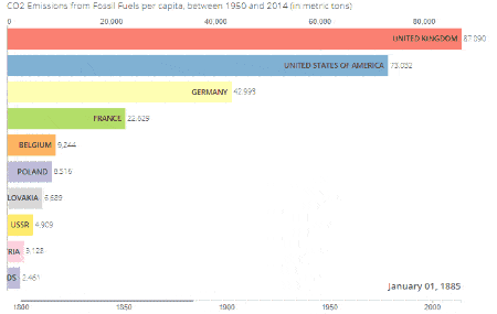
LiveGap Charts
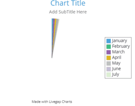
LiveGap Charts is a free animated graph maker website. This website can help you make various types of charts with animation. You can simply pick the type of chart you want to make and then add your data. It has a spreadsheet where you can insert your data to map it in the chart. Alternatively, it lets you import data from a CSV file as well. You can also export the chart data to CSV if needed. As you add data, it instantly gets represented on the chart. Then you can customize the various aspects of the chart including title, subtitles, legend, color, segment, annotation, and animation. In the end, you can save the chart as a WEBM video. While doing so, you get to pick the duration of the animation.
How to make an animated chart with LiveGap Charts?
- Head over to the LiveGap Charts website using the link below and select Make your Chart.
- On the next screen, pick the type of chart that you want to make.
- Then add your data to the sheet or import CSV from the Data section.
- Use the Settings on the right to customize the chart text, color, naming, etc.
- In the end, click on the save icon below the chart, pick the Video option, and set the duration to save the video.
Highlights:
- Type of graphs: Line Graph, Area Chart, Bar Chart, Horizontal Bar Chart, Stacked Bar Chart, Stacked Horizontal Chart, Pie Chart, Doughnut Chart, Polar Area Chart, Step Chart, and Radar Chart.
- Comes with a wide gallery of customizable templates.
- Import and Export graph data to CSV.
- Options to customize every aspect of the graph.
- Options export as an image (still graph) and as a video (animated graph).
- HTML export is paid feature.
Flourish Studio

Flourish Studio is a website where you can turn your data into interactive stories. On this website, you can create a wide variety of graphs, heatmaps, pictograms, Scatter charts, 3D maps, Hierarchy, and more. You can pick what you want to create and it opens that graph in an editor. It shows you a preview of that with random data. You can add your data to that manually or import from CSV, Excel, TSV, JSON, or GeoJSON files. Coming to the graph, you get a set of options to change the appearances by changing text, color, filters, background, etc. You can also add popup panels, layout, header, footer, annotation as well. Along with that, you get animation options where you configure animation and set its duration. This website does not let you download the chart in the free plan. You have to publish the chart and then it gives you a URL to the chart along with embed code. The process of creation is private and you do have to add attribution with the chart. Apart from that, this website has a story feature. This lets you add background audio to your chart in order to create interactive stories.
How to make an animated chart with Flourish Studio?
- Go to the Flourish Studio website and sign up for a free account.
- When you are on the My Projects page, select the New visualization option to create a new chart.
- On the next screen, select the type of graph you want to make.
- It loads a preview of the graph, go to the Data tab from the top and add your data.
- Then customize the charts from the Preview tab as per your needs.
- In the end, publish the graph from the top right corner to get a URL to it.
Highlights:
- Type of graphs: Line, Bar & Pie Charts, Projection Map, Scatter, 3D Map, Hierarchy, Line Chart race, Heatmap, Radar Chart, Pictogram, Table, Bubble Chart, Parliament Chart, and much more.
- Import data from CSV, Spreadsheet, JSON, GeoJSON, and TSV.
- Options to customize every aspect of the graph.
- Create a story with graphs and audio.
- Offers only URL and embed link upon publishing the chart (privately); no download.
- HTML export is paid feature.
BarChar Trace
As the name suggests, BarChar Trace is a free online tool to generate racer bar charts. In such a chart, the bar graphs move to visualize the change in the values over time or other data set. So this is a tool to create that type of bar chart specifically. It takes data from a CSV file. In order to make this work, the data in the CSV have to be in a certain format (mentioned on the website). In the end, this tool visualizes the chart on the screen with animation. There is no option to download or share the chart. That’s because this is tool represents how this tool works. If you want to add a racer chart on your website or somewhere, you can get the code of this tool from GitHub, replace the datasets with your CSV file(s) and add it to the website.
How to make an animated chart with BarChar Trace?
- Use the link given below to open this tool in your browser.
- Upload your CSV data file with the supported data format.
- Set the animation duration and number of bars to display along with the title.
- Then click on the GENERATE BAR CHART RACE button to get the animated chart.
Highlights:
- Type of graphs: Bar Chart only.
- Imports data from a CSV file.
- Visualize charts online with no option to share or download.
- Open-source code that you can use to build racer charts into your website.


About Us

We are the team behind some of the most popular tech blogs, like: I LoveFree Software and Windows 8 Freeware.
More About UsArchives
- May 2024
- April 2024
- March 2024
- February 2024
- January 2024
- December 2023
- November 2023
- October 2023
- September 2023
- August 2023
- July 2023
- June 2023
- May 2023
- April 2023
- March 2023
- February 2023
- January 2023
- December 2022
- November 2022
- October 2022
- September 2022
- August 2022
- July 2022
- June 2022
- May 2022
- April 2022
- March 2022
- February 2022
- January 2022
- December 2021
- November 2021
- October 2021
- September 2021
- August 2021
- July 2021
- June 2021
- May 2021
- April 2021
- March 2021
- February 2021
- January 2021
- December 2020
- November 2020
- October 2020
- September 2020
- August 2020
- July 2020
- June 2020
- May 2020
- April 2020
- March 2020
- February 2020
- January 2020
- December 2019
- November 2019
- October 2019
- September 2019
- August 2019
- July 2019
- June 2019
- May 2019
- April 2019
- March 2019
- February 2019
- January 2019
- December 2018
- November 2018
- October 2018
- September 2018
- August 2018
- July 2018
- June 2018
- May 2018
- April 2018
- March 2018
- February 2018
- January 2018
- December 2017
- November 2017
- October 2017
- September 2017
- August 2017
- July 2017
- June 2017
- May 2017
- April 2017
- March 2017
- February 2017
- January 2017
- December 2016
- November 2016
- October 2016
- September 2016
- August 2016
- July 2016
- June 2016
- May 2016
- April 2016
- March 2016
- February 2016
- January 2016
- December 2015
- November 2015
- October 2015
- September 2015
- August 2015
- July 2015
- June 2015
- May 2015
- April 2015
- March 2015
- February 2015
- January 2015
- December 2014
- November 2014
- October 2014
- September 2014
- August 2014
- July 2014
- June 2014
- May 2014
- April 2014
- March 2014
