10 Best Free Data Visualization Tools For Windows
This list contains best free data visualization tools for Windows. Data interpretation with visualization makes data analysis process very easy. Here comes the role of these free data visualization software. With the help of these freeware, you can visualize data using different type of graphs. Most of these software let you plot Bar, Line, Pie, Column, Area, Net, Stock, etc. graphs. In many of them, you can save these graphs as images or templates.
Some of these freeware let you adjust transparency, gradient, blur, spacing, etc. of the generated graph. Most of them generate colorful graphs using default colors, but in some of them you get option to choose color palette. You can apply different patterns to the graph elements, such as texture fill, solid fill, gradient fill, etc. Also, many of them let you generate 2D as well as 3D graphs.
These data visualization tools let you save files with graph as CSV, XLSX, XLS, ODF, ODS, etc. Furthermore, in many of them, you can export graphs as image in JPG, PNG, TIF, BMP, GIF, etc. formats.
My Favorite Data Visualization Tool For Windows:
LibreOffice is one of my favorite data visualization software, as it lets you plot a number of graphs including column, bar, pie, area, line, Bubble, Net, Stock, etc. You can generate 2D and 3D graphs as well. Additionally, you can change the rendering style of these graphs. Also, it is one of the best free alternative to MS Office.
You can also checkout lists of best online infographic maker, infographic maker, and fishbone diagram maker software for Windows.
LibreOffice
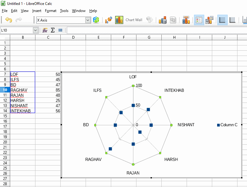
LibreOffice is one of the best free data visualization software. Using this software, you can generate a variety of colorful graphs, such as column, bar, pie, area, line, Bubble, Net, Stock, etc. Some of these graphs support 3D graphical representation of data, and also let you change their shape. You can select shapes from pyramid, cylinder, cone, etc.
To generate graphs for data visualization, open an Excel sheet or create a new one, and enter data from available data sources. Now, select entered data, and go to Insert menu to access option ‘Chart’. Now, you will be able to access all aforesaid chart types and option to specify Data Range and Data Series. Click on desired chart type and the respective graph will be plotted. Click on ‘Finish‘ button, when you are done with chart design process.
In this software, you can add title, subtitle, elements at X, Y, and Z-axis, etc. by using Chart Element option. And, by using Chart Wall Menu, you can change graph line properties, color, transparency, gradient, and many other parameters.
After successful generation of graph, you can use ‘Export as image’ option to save the graph in your PC in either of supported format, which are PNG, BMP, EMF, GIF, JPEG, SVG, SVM, TIFF, WMF, etc.
LibreOffice is a feature rich office suite. Apart from utilizing it as a data visualization tool, you can use it to create fishbone diagrams, convert HTML to PDF, create timeline, view .MDB files, and more.
WPS Office
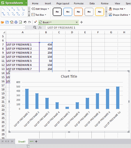
WPS Office is another free, cross platform office suite in this list. Using this free data visualization program, you can easily generate a variety of graphs to get numeric data visualization.
To attain graphical data representation, all you need to do is, open spreadsheet, make entries of numerical data, and select all entries. Now by clicking on Insert menu, you can easily access Chart option, which helps you generate graphs for data visualization.
As is with other office suites of this list, it also lets you generate a variety of graphs, such as Bar, Line, Pie, Column, XY (Scatter), Stock, Radar, Combo, etc.
After successful generation of graphs, you can save them for further reference in the local folder of your PC in JPG, PNG, TIF, or BMP format. You can also save these graphs as Template in CRTX format. It also lets you move chart between two sheets using dedicated Move option.
This free software even facilitates you with 1GB of cloud storage, to save your data online for easy access from anywhere. You just need to sign in to avail this facility.
ONLYOFFICE
ONLYOFFICE is another free office suite that can be used as a software to visualize data. Data visualization can be easily done in spreadsheet of this office suite. You can either create a new spreadsheet and make data entry, or open an existing one to generate graph for its data visualization. Like some other listed office suites, it also lets you generate different kind of graphs, which are Column, Line, Pie, Bar, Area, XY(scatter), and Stock.
After providing data to visualize them, you need to choose ‘Insert Chart or Sparkline’ option. Now, it will show the list of all supported graph types, so that you can choose an appropriate one to visualize data in suitable form. After generating data visualizing graphs, you can save the file containing data and graph as well, in PDF, XLSX, ODS, or CSV format.
SSuite Office Personal Edition
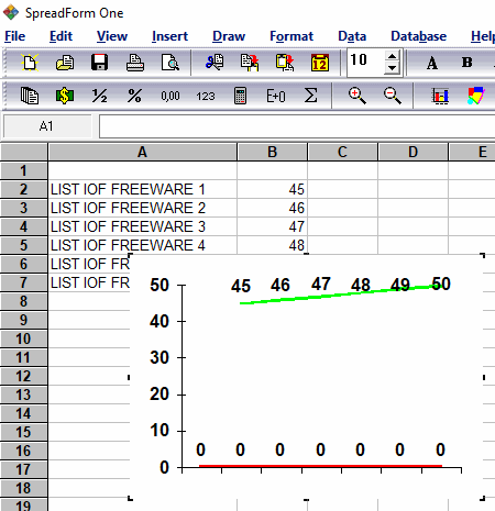
SSuite Office Personal Edition is another good software to be used as data visualization software. As the name suggests, it is also an office suite that provides similar features as you get in other office suite software.
To use this software for data visualization, you need to enter the data in its SpreadForm, or open an existing file. When you are done with data entry, select the data and go to Insert menu > Chart option. Now, you can generate data visualizing graphs in 2D or 3D mode. It lets you generate Area, Bar, Line, Gantt, Doughnut, etc. You can choose from different chart types, and also change their rendering style. You also get option to set values for secondary axis, and X, Y, and Z-axis.
It supports VTS, XLS, and TXT formats to save files.
Gnumeric
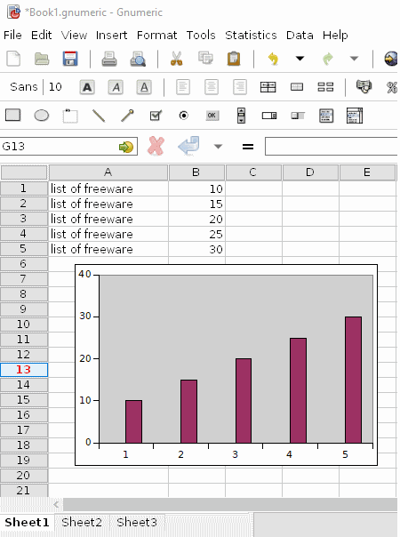
Gnumeric is next in the list of best free data visualization tools. As you open this freeware, it displays an empty spreadsheet to make data entries. You can also open any available spreadsheet having XLSX, XLS, SYLK, ODS, SXC, or Gnumeric format. Once you are done with data loading, select entire data and go to Insert menu. From there, you need to choose Chart option to generate visual plots like Area, Bar, Bubble, Line, Drop Bar, Pie, Polar, Radar, Ring, etc. Each of these plots comes with different rendering styles categorized under ‘Subtype’ menu. After selecting a plot type and its presentation style, you need to select Insert option and then click on the desired location in the spreadsheet to get a visible plot.
For further reference, you can save the plot as SVG, PNG, JPEG, PDF, PS, EPS file using ‘Save as image’ option.
IBM Lotus Symphony
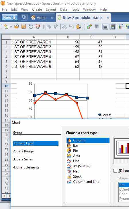
IBM Lotus Symphony is another free software that can be used as a data visualization program. It basically provides three services that are analogous to MS Word, Excel, and Powerpoint.
To use data visualization feature of this freeware, you need to make entries of your numeric data in its Spreadsheet, or open an existing one. After that, select the entire data and go through the following path: Create (menu) >Chart (option). It can generate Column, Bar, Pie, Area, Line, Stock, Net, etc. graphs in order to provide better data visualization. Some of these graphs can be even generated in 3D. After creating a graph, you can anchor it to a particular cell or to a page. Like many of these software, you can adjust transparency, gradient, etc. parameters of the chart wall.
You can save complete data along with generated graph in ODS, OTS, STC, XLS, XLT, CSV, etc. formats. It also lets you Export files as PDF.
Softmaker Free Office

Softmaker Free Office is another free office suite package that can be used for data visualization using graphs. This package contains three basic tools, namely, TextMaker, Presentations, and PlanMaker, which are analogous to MS Word, Powerpoint, and Excel, respectively.
To use this visualization software, you need to open its PlanMaker utility, and make entries of data. After that, select entire data and go to ‘Object’ menu to gain access to ‘New Chart Frame’ option. As you select this option, you will have a list of multiple chart types including Column, Bars, Lines, Areas, Cones, Box Plot, Stock Chart, etc. Also, you can select color palette to make visualization more attractive. The available color palettes are Excel 2010’s black, blue, green, purple, etc. You can also change presentation style of these graphs by choosing appropriate chart Subtype.
You can save the graph as image in either of following supported file formats: PNG, JPG, GIF, BMP, or TIF. Also, you can save the complete file in XLS, CSV, PMDX, PMV, XLT, etc. formats.
SSuite Accel
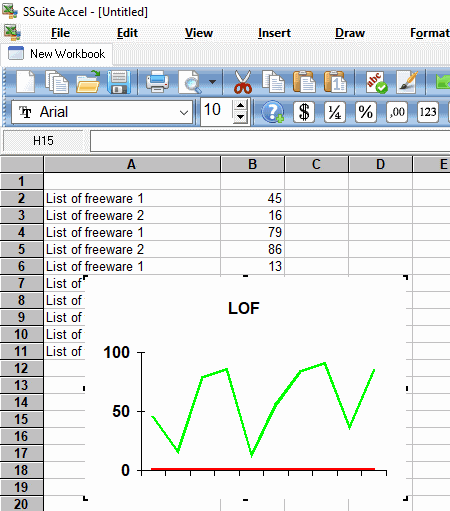
SSuite Accel is yet another software for Windows that lets you generate different type of charts for data visualization. To do so, you can either open an existing spreadsheet, or a create a new one. When you are done with data entry, just select the entire data and go to Insert > Chart option. Now, you can select from different available chart types to visualize data in that form. Some most frequently used chart types are: Area, Pie, Bar, Line, Gantt, Bubble, and XY(Scat). You can plot all these graphs in 2D and 3D view. Also, you can apply different rendering style using ‘Style’ option.
It also supports multiple file formats to save files like VTS, XLS, ATP, CSV, etc.
Graph Maker
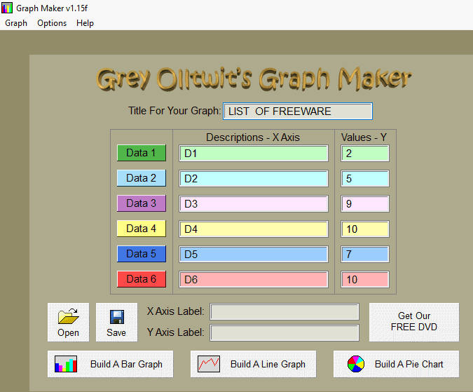
Graph Maker is a free data visualization tool that lets you represent and analyze data in various graphical forms. Using this software, you can easily generate three types of graphs, namely, Bar Graph, Line Graph, and Pie Chart.
It is a handy data visualization software. All you need to do is, just enter the data in specified field. After that, you can easily access options to generate aforementioned graphs. It is possible to distinguish among data from different sources, as these graphs use different color for different data source.
You can save these plots in your PC and for that purpose, it supports GOG file format.
One of the biggest limitation of this software is that it only lets you plot graphs for maximum 6 data sources.
Free Graph maker
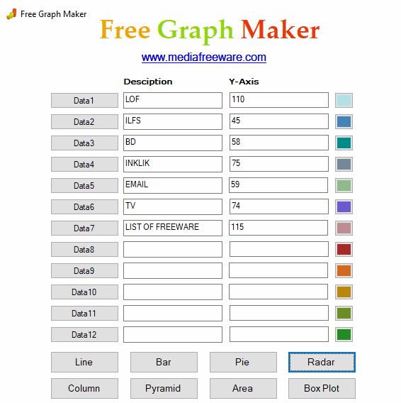
Free Graph maker, as the name suggests, is a graph maker software for Windows, which helps to represent data in visual form. It facilitates you to generate different kind of charts to visualize data, such as Line, Bar, Pie, Radar, Pyramid, Box Plot, Area, etc.
To visualize data in any of these graphical forms, you just need to enter data along with description about the source and value for Y-axis. After that, by selecting one of these graphs, you can have visualization of data in that particular colorful graph. At the same time, it displays you options to save or print the generated graph.
Unlike Graph Maker (saves graph in GOG format), it saves generated graphs in most commonly used image formats, that are JPEG, BMP, and GIF.
Note: You can enter data maximum from 12 data points.


About Us

We are the team behind some of the most popular tech blogs, like: I LoveFree Software and Windows 8 Freeware.
More About UsArchives
- May 2024
- April 2024
- March 2024
- February 2024
- January 2024
- December 2023
- November 2023
- October 2023
- September 2023
- August 2023
- July 2023
- June 2023
- May 2023
- April 2023
- March 2023
- February 2023
- January 2023
- December 2022
- November 2022
- October 2022
- September 2022
- August 2022
- July 2022
- June 2022
- May 2022
- April 2022
- March 2022
- February 2022
- January 2022
- December 2021
- November 2021
- October 2021
- September 2021
- August 2021
- July 2021
- June 2021
- May 2021
- April 2021
- March 2021
- February 2021
- January 2021
- December 2020
- November 2020
- October 2020
- September 2020
- August 2020
- July 2020
- June 2020
- May 2020
- April 2020
- March 2020
- February 2020
- January 2020
- December 2019
- November 2019
- October 2019
- September 2019
- August 2019
- July 2019
- June 2019
- May 2019
- April 2019
- March 2019
- February 2019
- January 2019
- December 2018
- November 2018
- October 2018
- September 2018
- August 2018
- July 2018
- June 2018
- May 2018
- April 2018
- March 2018
- February 2018
- January 2018
- December 2017
- November 2017
- October 2017
- September 2017
- August 2017
- July 2017
- June 2017
- May 2017
- April 2017
- March 2017
- February 2017
- January 2017
- December 2016
- November 2016
- October 2016
- September 2016
- August 2016
- July 2016
- June 2016
- May 2016
- April 2016
- March 2016
- February 2016
- January 2016
- December 2015
- November 2015
- October 2015
- September 2015
- August 2015
- July 2015
- June 2015
- May 2015
- April 2015
- March 2015
- February 2015
- January 2015
- December 2014
- November 2014
- October 2014
- September 2014
- August 2014
- July 2014
- June 2014
- May 2014
- April 2014
- March 2014
