9 Best Free Open Source Data Visualization Tools for Windows
Here is a list of Best Free Open Source Data Visualization Tools for Windows. These are the data visualization software which come with an open source license. Hence, users can freely download the source codes of these software and then study or modify it as per their requirement. If you want to check out all free data visualization tools, see this article.
These software let you analyze numerical data using various kinds of graphs. Some of these graphs are Bar, Column, Pie, Area, Line, Bubble, Net, Stock, Doughnut, Radar, Candlestick, Funnel, and Scatter. In a few of these software, you can even plot 3D graphs. You can even customize various parameters to configure graphs such as chart subtype, shape, chart legends, color schemes, etc.
The process of data visualization is pretty straightforward in all these software. You need to import (or create) a numerical dataset from a spreadsheet file and then use the dedicated option to insert a specific chart while specifying data series and range. For importing data, these software support spreadsheets in formats like CSV, TSV, XLS, XLSX, DAT, etc. If you want, you can save the chart as images (PNG, SVG, JPG, BMP, etc.) or PDF file in these software.
Many of these open source data visualization tools are spreadsheet software. So, you can find a lot more handy features in these, such as mathematical functions, statistics calculation algorithms, spreadsheet creation features, etc. Overall, these are quite featured software which you can use for analysis of numerical data.
My Favorite Open Source Data Visualization Tools for Windows:
SciEnPlot is one of my favorite software to visualize data on graphs. It lets you plot various types of 2D as well as 3D charts. Some data evaluation and computing features are also provided in this software.
I also like LibreOffice Calc as it lets you quickly and easily plot various graphs. Also, it is a featured spreadsheet creation software with a lot of related tools.
You may also like some best free 3D Data Visualizer Software, Open Source Graphing Software, and Data Mining Software for Windows.
SciEnPlot
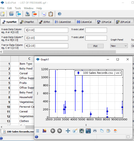
SciEnPlot is a free open source data visualization software for Windows and Mac. It is a featured graphing software which lets you plot numerical data in the form of various charts. You can generate both 2D and 3D charts using this software. Specifically, it lets you create symbol plots (bar, bowtie, checkmark, circle, cross X, line, pentagon, hexagon, vline, etc.), ColorMap surface plots (bar, contour, line scatter, scatter, pie, surface, etc.) and 3D graphs (bar, surface, scatter, line fill, etc.). Let’s checkout the procedure to create data visualization charts in it.
How to visualize data on graphs using this free open source data visualization tool:
- Go to the File > Import data option to open a CSV or TXT file with numerical dataset. Or, you can manually enter the data in a new blank spreadsheet.
- Now, go the graph tab as per the type of chart you want to plot and select the dataset to visualize. You can set the data range, axis label, symbol type, graph panel, symbol color, etc., for data visualization.
- After setting up graph properties, click on the Plot button and it will generate the respective graph.
- The generated plot can be saved as an image in formats like PNG, PS, EPS, EMF, JPG, SVG, TIFF, etc.
Additional Features:
- You can calculate various statistics for the dataset in a spreadsheet and plot a histogram for results too. It lets you compute statistics like sum, minimum, maximum, mean, median, standard deviation, P value, chi-square, etc.
- It offers a handy feature to compute 1D and 2D functions with plot.
- It lets you solve Least Square Nonlinear Curve Fitting problems for a specific dataset.
- Convert Matrix to XYZ Columns, Note Board, Create Custom Functions, etc., are some more features of this graphing software.
Conclusion:
All in all, it is one of the best data visualization software to analyze simple and complex numerical dataset using different types of graphs.
LibreOffice Calc
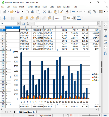
LibreOffice Calc is an open source spreadsheet software which can also be used as a data visualization tool. It is available for all major operating systems including Windows, Mac, and Linux.
Using it, you can plot dataset contained in various file formats including CSV, XML, XLSX, XLS, XLT, ETT, DIF, WKS, ODS, etc. It is capable of generating a variety of charts to visualize and analyze data. Some of these chart types include Bar, Column, Pie, Area, Line, Bubble, Net, Stock, Column and Line, and Scatter. You can also customize the look and appearance of chart by setting up parameters like shape, 3D look, chart wall properties, chart elements, etc. After generating a graph, you can save it with the spreadsheet or as images like PNG, BMP, JPG, GIF, WMF, TIF, SVG, etc.
Let’s see what is the exact procedure to visualize a dataset using this open source software.
How to generate data visualization graphs in LibreOffice Calc:
- At first, manually enter the dataset in a blank spreadsheet or import an existing spreadsheet in any of the supported formats.
- Next, select the dataset which you want to plot from its interface.
- Now, go to the Insert menu and select Chart option. It will open up a Chart Wizard window where you need to select a chart type, subtype, and configure other properties of a chart.
- After setting up chart options, click on the Finish button to plot the graph. You can save the plotted graph in any of the supported output formats.
Additional Features:
- As it is a spreadsheet software, you get many more related tools and features in it, such as mathematical functions, formulas, spellcheck, encrypt spreadsheet, etc.
- This software comes with the famous office suite called LibreOffice. So, you get other office software in the package, such as LibreOffice Writer, LibreOffice Impress, LibreOffice Draw, etc.
Conclusion:
It is one of my favorite software to visualize data on graphs as it is feature rich yet very simple to operate.
DBPlot
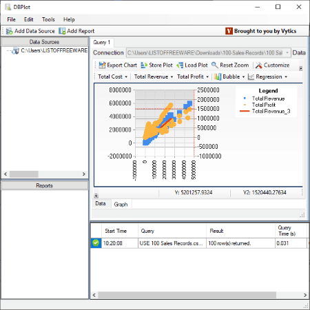
DBPlot is another open source data visualization tool for Windows. It allows you to plot datasets from multiple sources including MySQL, MsSQL, PostgreSQL, SQLite, and CSV files. This software can plot graphs of several types including bubble, point, line, spline, bar stacked bar, column, area, pie, doughnut, stock, candlestick, radar, funnel, pyramid, and a lot more.
How to visualize data in DBPlot:
- Firstly, click on the Add Data Source button to import datasets from any of the supported sources.
- Now, from the Data Sources section at left, double click on an input dataset and it will display all the consisting rows and columns on its screen.
- If you want to filter the dataset to view only selected rows and columns, you can enter the respective query by using the New Query button.
- After that, go to the Graph tab in the window below and then set up parameters like columns to plot, chart type, chart appearance, etc., to visualize the dataset.
- You will be able to view the selected graph in real time with the legends.
- The plotted chart can be exported in image formats including BMP, JPG, GIF, and PNG. Also, you can store the plot as Plot Markup Language File.
Additional Feature:
- It provides a Regression Analysis (linear, polynomial, logarithmic, exponential, power) feature to evaluate relationship between two or more variables in CSV files.
Conclusion:
It is a featured open source data visualization software which you can use to plot dataset using a variety of chart types.
Veusz
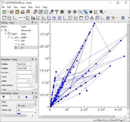
Veusz is yet another free open source data visualization software for Windows, Mac, and Linux. It is basically a scientific graphing software which lets you create or import datasets to visualize them on graphs. This software can plot 2D as well as 3D graphs.
How to plot data on graphs using this free software:
This is an example to plot a simple 2D graph for a dataset:
- Go to its Data menu and select Import or Create option to add numerical data. To import, it supports file formats like DAT, TSV, CSV, FIT, etc.
- After that, from the Insert menu, click on the Add xy option.
- Now, go to the Properties panel and select X and Y column to plot. You can also format graph by setting up options like marker, marker size, color, plot line, marker border, marker fill, etc.
- You can save the plotted graph in various formats including PDF, SVG, EMF, PNG, BMP, JPG, TIFF, etc.
Additional Feature:
It comes with some samples of graph projects (in its installation folder) which you can directly import to this software. After importing the projects, add your own dataset and then select the columns to plot.
Conclusion:
It is a great open source data visualization tool to plot simple as well as complex graphs.
Gnuplot
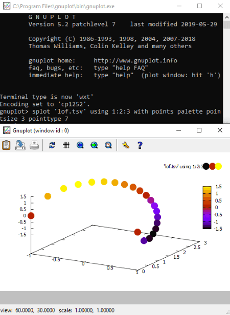
Gnuplot is a command based open source data visualization tool for Windows, Mac, Linux, and BSD. Using it, you can generate various 2D and 3D graphs with simple commands. You can create line, point, box, contour, vector field, surface, and more types of graphs with this software. It lets you input files of CSV, TSV, TXT, and other formats for visualization of consisting datasets.
As it is command line based visualization software, you need to know specific commands to generate a specific type of graph. Below is an example of a 3D projection graph for data contained in a file. Let’s check it out.
How to visualize data on graphs using command with Gnuplot:
- After installing this software, go its installation folder and then bin subfolder. From this folder, run the gnuplot.exe file and it will open up in the Command Prompt. Also, copy and paste input data file into this bin folder.
- Now, to generate a 3D graph, first, write this command
set key offand hit Enter. - Next, write another command like
splot 'input file with extension' using 1:2:3 with points palette pointsize 3 pointtype 7and hit Enter. In this command, you need to specify the input file name with its extension like ‘lof.tsv’. - As you hit enter, it will generate the 3D graph in a new window, which you can view and analyze with zoom, autoscale, and other options. Additionally, you can export the graph to a file (PNG, SVG, PDF, EMF) and print it too.
In a similar manner, you can generate other types of data visualization graphs using commands. You can check related commands in its official documentation or on this webpage.
Conclusion:
It is a nice free open source data visualization tool which can generate high quality 2D and 3D graphs with simple commands. But, you need to know exact commands in order to plot dataset. For that, I recommend you to check its documentation or online tutorials.
Gnumeric
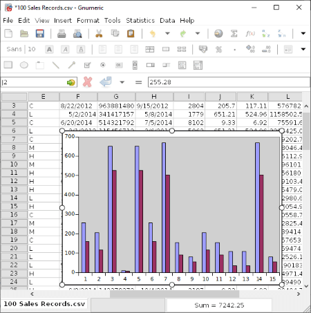
Gnumeric is another open source spreadsheet software which can also be used as a data visualization tool. It lets you enter or import dataset and then plot it using various graphs such as Area, Bar, Bubble, Column, Contour, DropBar, Line, Matrix, Pie, Polar, Radar, Ring, Statistics, Surface, Scatter, and some more.
How to visualize data using Gnumeric:
- Open a spreadsheet file or manually enter the data in a blank spreadsheet. And then, manually select the data which you want to plot.
- Now, go to the Insert menu and select the Chart option. It will give you multiple chart types’ options to generate a graph.
- Select a chart type and customize parameters like chart subtype, data series, style, theme, scale, format, etc.
- When done setting up output chart parameters, hit the Insert button to generate the selected graph for visualizing dataset.
- You can later save the plotted chart as SVG, PNG, JPEG, PDF, PS, and EPS files.
Additional Features:
- You can use various mathematical algorithms to perform different calculations on imported datasets. These algorithms include Descriptive Statistics, Sampling, Dependent Observation, One Sample Test, Two Sample Tests, and Multiple Sample Tests.
- It contains a library of mathematical functions which can be used for data evaluation, such as Bitwise Operations, Logic, Mathematics, Number Theory, Complex, Engineering, Random Numbers, String, etc.
- Some more handy tools related to spreadsheet managements are provided in it, e.g., Auto Correct, Goal Seek, Solver, Auto Save, etc.
Conclusion:
Gnumeric is a nice and simple open source data visualization tool which is basically a spreadsheet software.
Note: You can download the source code of this open source data visualization software from here.
LiveGraph

LiveGraph is a portable open source data visualization tool for Windows, Linux, and Mac. It is a Java-based software, so you need to have Java installed on your system to run this software. It can plot dataset from CSV files and Generic Data files (.dat).
How to visualize data using this portable open source data visualization software:
First, in its Data File Settings window, import a file in a supported format. As you do that, a graph with all numerical dataset will be plotted. You can customize this plotted graph by configuring data series settings such as columns to plot, color, transformation (actual value, log to specified base, transform into, or scale by specified value), transform parameter, etc. It also lets you set up graph settings like viewport, vertical grid, horizontal grid, etc.
You can save the plotted graph in formats like BMP, JPEG, PNG, GIF, etc.
Conclusion:
It is a decent software to plot numerical dataset in real time.
CSV2ScatterPlot
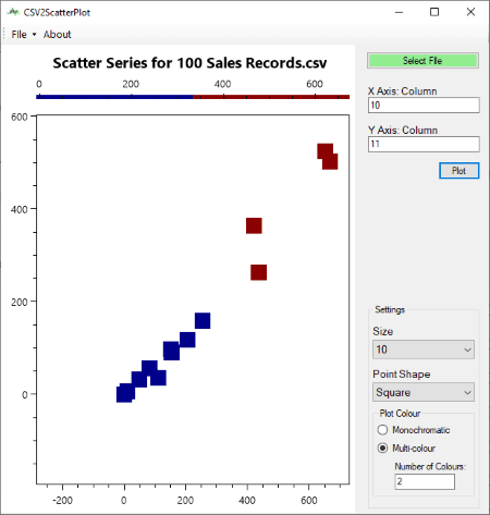
CSV2ScatterPlot is another one of free open source data visualization tool for Windows. As the name suggests, it lets you generate scatter plots to visualize datasets. Also, you can plot line series graphs using it.
How to plot datasets using this open source data visualization tool:
- In its Select File field, give path of input dataset in the format of CSV or TXT.
- After doing so, enter the columns you want to plot in X-Axis and Y-Axis fields.
- In case you want to plot line series, enable the respective field and set line color and point color from the interface. If not, leave it unchecked.
- You can now customize the scatter plot by setting up parameters including point shape, size, point or line color, and plot color profile (monochromatic or multi-color).
- In the end, click on the Plot button to visualize data on the graph. You can save this graph as a PNG image.
Conclusion:
It is a nice and simple option to visualize CSV or TXT datasets on scatter graphs.
ONLYOFFICE Desktop Editors
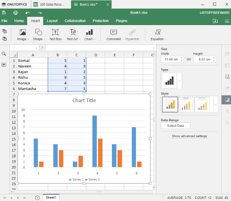
ONLYOFFICE Desktop Editors is the next free open source data visualization tool for Windows, Linux, and Mac. Like many other listed software, it is also a spreadsheet software which lets you create or edit spreadsheets. Apart from creating or modifying spreadsheets, you can also visualize numerical datasets using various types of charts. You can plot a total of 5 types of charts in it namely Column, Line, Area, Pie, and Bar.
How to visualize dataset using ONLYOFFICE Desktop Editors:
- Firstly, manually enter the numerical data in different columns. It also provides option to import Excel spreadsheets but during my testing, there were a few formatting errors.
- After that, select the columns or specific data which you want to plot and go to Insert > Chart option and select the chart type and subtype.
- You can now customize various settings to configure chart accordingly, such as chart title, legend, data labels, axis options, style, etc.
- To save chart image, you can copy and paste it in an image editor and then export it.
Additional Features:
It provides a lot of spreadsheet specific features like insert functions, add equations, insert images, encrypt spreadsheet, etc.
Conclusion:
This can be your another alternative if you’re looking for a simple open source data visualization tool for desktop.


About Us

We are the team behind some of the most popular tech blogs, like: I LoveFree Software and Windows 8 Freeware.
More About UsArchives
- May 2024
- April 2024
- March 2024
- February 2024
- January 2024
- December 2023
- November 2023
- October 2023
- September 2023
- August 2023
- July 2023
- June 2023
- May 2023
- April 2023
- March 2023
- February 2023
- January 2023
- December 2022
- November 2022
- October 2022
- September 2022
- August 2022
- July 2022
- June 2022
- May 2022
- April 2022
- March 2022
- February 2022
- January 2022
- December 2021
- November 2021
- October 2021
- September 2021
- August 2021
- July 2021
- June 2021
- May 2021
- April 2021
- March 2021
- February 2021
- January 2021
- December 2020
- November 2020
- October 2020
- September 2020
- August 2020
- July 2020
- June 2020
- May 2020
- April 2020
- March 2020
- February 2020
- January 2020
- December 2019
- November 2019
- October 2019
- September 2019
- August 2019
- July 2019
- June 2019
- May 2019
- April 2019
- March 2019
- February 2019
- January 2019
- December 2018
- November 2018
- October 2018
- September 2018
- August 2018
- July 2018
- June 2018
- May 2018
- April 2018
- March 2018
- February 2018
- January 2018
- December 2017
- November 2017
- October 2017
- September 2017
- August 2017
- July 2017
- June 2017
- May 2017
- April 2017
- March 2017
- February 2017
- January 2017
- December 2016
- November 2016
- October 2016
- September 2016
- August 2016
- July 2016
- June 2016
- May 2016
- April 2016
- March 2016
- February 2016
- January 2016
- December 2015
- November 2015
- October 2015
- September 2015
- August 2015
- July 2015
- June 2015
- May 2015
- April 2015
- March 2015
- February 2015
- January 2015
- December 2014
- November 2014
- October 2014
- September 2014
- August 2014
- July 2014
- June 2014
- May 2014
- April 2014
- March 2014
